By Tim Cole
The Internet is the most disruptive force in church communication since the invention of Gutenberg’s printing press in 1439. Your church’s front door may be located on your property, but in many ways the church’s website serves as the new digital screen door through which your potential guests will decide beforehand if they will venture to and through the physical front door.
Recently I consulted with an older church overseas about why they weren’t attracting and keeping enough visitors to spur consistent growth. My onsite visit revealed several potential problems, but one stood out. The urban church with a surprising amount of walk-up traffic had a critical first-impressions issue. Their facility featured an oversized, windowless, wooden front door as their primary street-side entrance. The door needed maintenance and was extremely difficult to open, and it was impossible for a potential guest to see what they would find on the other side.
We have discovered many churches in our East Coast region have a similar problem. Their dated, digital screen doors suffer from a lack of regular maintenance and are difficult to navigate, making it difficult for potential guests to envision what they will experience should they eventually visit.
Here are six common website mistakes, along with best practices, we have seen in churches we serve:
1. No Website
A 2014 Lifeway Research study showed (surprisingly) about one in five churches in America did not have a website. Many vendors make it easy and affordable to create a simple website that is attractive to guests and instills a positive impression of what your church family looks like.
2. A Dated Website Design
Isn’t it frustrating when the expensive new car you purchased last year suddenly looks out-of-date when the manufacturer redesigns that model for this year?
In the same way, a church’s modern, functional website can suddenly appear dated when a new design format comes into vogue. As a result, a healthy church may suddenly seem old-fashioned to a prospective guest.
A website design trend called parallax scrolling has emerged over the past several years. “Parallax scrolling is when the . . . background of the web page mov[es] at a slower rate to the foreground, creating a 3D effect as you scroll,” a Creative Bloq (www.creativebloq.com) art and design website article stated. “Used sparingly it can provide a nice, subtle element of depth that results in a distinctive and memorable website.”
As of this writing, Forefront Christian Church (https://forefront.org) in Virginia Beach, Virginia’s church plant of Waypoint Church Partners was using this feature on the front page of their website.
I also particularly like when sites use a video banner design feature on the home page instead of a static image. A series of a dozen or more very short video images of a church’s Sunday morning experience—each two seconds or less in length—woven together in a continuous loop gives prospective guests a virtual video tour highlighting the best impressions a church would like to make before prospects ever enter.
Collective Christian Church in Frederick, Maryland (www.mycollective.church)—another Waypoint church plant—was using this design feature at the time this was written.
3. A Site Not Optimized for Mobile Device or Tablet Use
Many older church websites were created when most prospective guests were still using laptop and desktop computers. Times have changed. Today, it’s likely most people will view your website from either a smartphone or a tablet.
When is the last time you viewed your church’s website from either a mobile device or a tablet? Try it—the experience may surprise you (and not in a good way). For many or most prospective guests, this will be their first impression of your church.
Two Rivers Church of Christ in New Bern, North Carolina (tworiverschurch.com), uses a website format optimized for mobile devices.
4. A Site That Features Property Rather Than People
My role with Waypoint Church Partners allows me to travel to a different church nearly every Sunday. I almost always check a church’s website before I arrive to get a sense of the first impressions—positive or negative—the church is making with prospective guests.
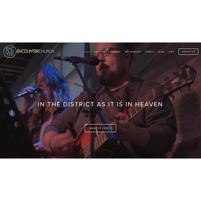
It still surprises me the number of churches that choose to feature an image of their building—often from a static, roadside perspective—instead of showing off the friendly people in their church. I’m convinced guests are more likely to gain a positive first impression of a church by seeing warm, smiling faces than images of brick and mortar, parking lots and pews.
Encounter Christian Church in Columbia Heights, in the District of Columbia (www.encounterdc.com), features a number of friendly faces on its website.
5. A Site Not Optimized for Search Engine Queries
I recently searched for the website of a church plant I would be visiting. When I typed the church’s name into Google and hit return, the church showed up as the 10th (and final) choice on the first page of results. I had to scroll down to find it.
Studies have shown that, at best, only 1 in 4 people will click through to the second page of online search results. Even the best-designed, most-welcoming church website is useless if your prospective guests never see it. Investing in resources to ensure the search engine optimization (often shortened as “SEO”) of your church’s website will improve both the quantity and quality of website traffic.
6. Failing to Feature Sermon Videos
Many churches fail to appreciate the increasing number of potential guests, possibly the majority of people considering a visit to your church, who screen the sermons on your website. Sermons in an audio format alone are no longer adequate.
Not only should a church’s sermons be posted online for those in the church who are unable to attend, but also to make a positive first impression for potential guests. Better yet, some churches are now pinning a short video clip, often only two or three minutes in length, of a particularly good sermon point being made by their preacher, to the top of their sermon page.
One of Waypoint’s partnering churches, East 10th Street Church of Christ in Roanoke Rapids, North Carolina, features what they call “Take Two” on the bottom of the sermon page of their website (www.easttenth.org/sermons). A two-minute video sermon summary is produced each week providing not only a tease for church members to view the full sermon, but also a video clip in a more appropriate format and length for members to repost on social media platforms for their friends to view.
Churches today often focus on critical systems—such as a well-trained guest services team or a simple children’s check-in interface—to create a positive first impression once their guests arrive onsite. Your church would be well-served to also focus on your digital screen doors where their first impressions of your church are more likely to be made.
Tim Cole serves as executive director of Waypoint Church Partners. Waypoint plants new Christian churches in the Mid-Atlantic region and supports established churches with strategic services to help them “get on mission and stay on mission.” Tim and his wife, Lisa, have helped plant churches in Virginia, Ukraine, and France. Tim loves to train and coach church leaders toward their God-given vision to lead healthy, growing churches.


